One of the first things we have decided to change in our new home is the colour of the walls. We want to paint right away both because the existing paint is old, and needs to be refreshed, but also because putting our colours up on the walls will make the house feel like our home, rather than someone else's.
Here are a few tips that we used along the way:
Tip #1 When choosing paint colours is that it's important to see the colours in context, preferably in a variety of the different light conditions that the room you're planning to paint will be seen in. Try taping paint swatches to the wall and living with them for a while to see which ones you like best at different times of day.
Tip #2 Invest in a small sample pot of the colour you're thinking of buying for about $5, and go ahead and paint it on the wall. Be sure to do two coats, so you can see what it will really look like. This was key for us in deciding which wall to have as the accent wall, and which to use a more neutral tone on.
Tip #3 Remember that you can order any colour at full strength, 75%, 50% or only 25% saturation. So if there's a colour that you like, but you think it's too dark, this may be a good option for you.
Tip #4 When you get your sample pot, you can ask them to mix it at 50% and show it to you, and then decide whether to leave it like that, or have them top it up to full strength. That way you can get an idea of what it would look like at half strength before you commit!
Tip # 5 Did you know that any paint company can match the colours in any other paint company's swatch book? We ended up using Benjamin Moore colours, but Behr paint, which was much less expensive!
It is pretty clear to us that pink isn't the right colour choice for our bedroom, and that we don't really love shiny ceilings, deciding which colours we do want to live with from here on out is more difficult than deciding which ones we don't like.
The very pink master bedroom in our new house.
In our last home, a condo in Austin, Texas that we sold last summer before moving to Toronto, we did a lot of painting, and we were really happy with the colours we ended up choosing. So, we seriously considered just using those colours again, since they worked so well the last time.

Here's our old living room painted in Behr's Yacht Harbour.
Here's our Austin kitchen with
cabinets in Behr's Pollen Grains.
Here is our old bedroom.
The colour is Behr's Green Tea.
On the other hand, we felt that it would be nice to have a fresh start in our new home, and that these colours (especially the blue) were cooler and so better suited to a warm climate like Austin.
Since we decided to go back to the drawing board, we thought that consulting with James' design-savvy Aunt Sue (who used to be an interior designer) would be a good place to start. She consulted her colour book (which happened to be from Benjamin Moore), and came up with some really out-there colour ideas for us, including Cool Aqua, Turquoise Powder or Bahaman Sea for the kitchen, Pale Avocado for the living room and accents in Marblehead Gold, Concord Ivory, orange, brown and purple.
Here are some of those colours:

Cool Aqua
Pale Avocado
Marblehead Gold
After thinking about it, we decided that these colours were a bit too bold for us at the moment, and that we wanted colours that would coordinate better with our stuff (since we don't have extra money for new furniture right now). So we went back to Aunt Sue with a request for a more subdued palette, and she had some great new suggestions including Benjamin Moore's Golden Harvest and York Harbour Yellow for the kitchen, Nantucket Gray or Georgian Green for the living room, Dunmore Cream for the foyer and hallways, and Copper Clay for the banister.
Here are some of those colours:

Golden Harvest

York Harbour Yellow
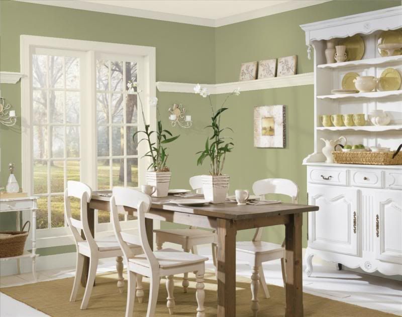
Georgian Green

Dunmore Cream
 Copper Clay
Feeling better about these ideas, and having checked out the colours online, we headed over to our local Benjamin Moore store to check out the colours in person and to pick up some swatches to take over to the house. We discovered that the ones we liked the most were part of the Historic Color collection. So, we decided to see if we could get all of our colours from that collection.
Here are the colours that we settled on after that trip:
On the left you have Bryant Gold, which we decided to use as an accent wall in the kitchen, along with Dunmore Cream for the non-accent walls. Because we really wanted the house to have some unity, we decided to use Georgian Green for three walls of the living room, and Dunmore Cream for the fourth. The accessories that we already have are navy blue, dark red and chocolate brown, so I think they'll go well.
We chose Georgian Brick, which is the red in the centre, for the banister, and Monterrey White (which Aunt Sue also suggested) for the banister spindles. The three colours on the right are the ones we're considering for accent walls in the upstairs bedrooms. They are Kennebunkport Green, Buckland Blue, and Hawthorne Yellow. We haven't made a final decision about the upstairs colours yet, though.
Before making a final decision, we used tip #2. We went to Home Depot and bought $5 sample pots of each of the colours we were considering for the living room and kitchen, which we wanted to paint first.
We used tips #3 and 4 when deciding on the Georgian Green and Dunmore Cream. As soon as we saw the sample pots of these colours at half strength, we knew that the Georgian Green looked too pastel for us at 50%, and had the sample bumped up to full strength. The Dunmore Cream looked better at half strength, since we wanted to use it as a nice bright neutral colour to offset the saturated accent walls, so we left it that way.
Deciding which walls to use the accent colours on and which to paint the more neutral half-strength Dunmore Cream took some time and some thinking. We used the sample paint to try out some ideas, and in the end we will be painting over some of the walls that the sample colours ended up on, since we changed our minds about which would be the accent walls. I'm glad that we tried it out though, because it really gave us a good idea of how each colour would look in context.
We painted the first coat on the living room ceiling (just plain flat white ceiling paint for that) and walls yesterday, and will be putting up the second coat this weekend. It's looking great already, and I can't wait to post photos for everyone to see.
Do you have any tips on how to choose paint colours to add to the list? I'd love to hear what techniques you use to feel confident that you'll like the colours that you've chosen once they're up on the walls, and see photos of the results!

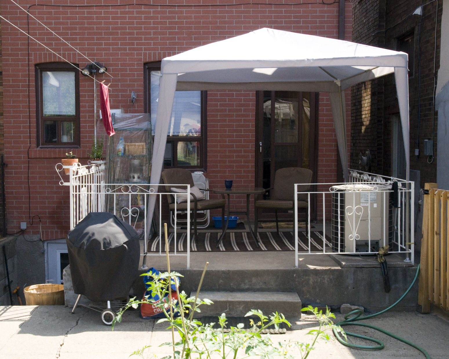
 I then attached two more 8' 1x2s, one to each end of the cross piece, using only one screw each so that I would be able to adjust the angle between each of them and the cross piece. This is how you control how much wider your trellis is at the top than it is at the bottom. I just sort of looked at it and adjusted it until it seemed right.